
Let’s have some fun. As you know, I don’t agree with the two-brand, three-livery approach Alaska Air Group is taking. So, here are my thoughts on a third AAG brand, which would better differentiate the different offerings of the group.
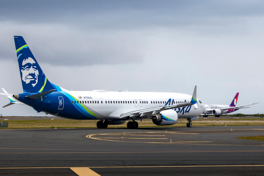
If you didn’t already read my post on Alaska Air’s new 787 livery, I suggest reading that post before delving into this one. However, the TLDR version is that I think having two unrelated liveries for a single brand is confusing, while the design doesn’t directly reference any of the existing brands and is quite vague. Moreover, I wouldn’t even have guessed that the livery is the Aurora Borealis if I wasn’t told so.
My Thoughts on a Third AAG Brand
Before I begin, let’s get one thing straight. I may work in marketing and branding, but I in no way claim to be an expert. So, take my thoughts on a third AAG brand with a huge grain of salt. They’re just that, my $0.02 that I quickly whipped together. Though, what makes it all the more frustrating is that AAG is the inspiration for my idea, anyway, which you’ll see in just a second.
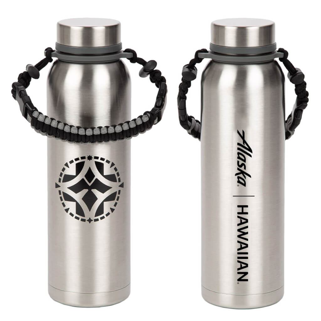
Fairly recently, AAG held an employee event in Honolulu to unveil a new design. No, this wasn’t the new livery or any other branding elements being previewed to employees. Rather, the event was for the unveiling of a design that symbolizes the coming together of these two airlines. While initially offered on a medallion to employees, the design now graces a couple of logo items available for purchase by the general public
 .
.
The design is supposed to be evocative of the Kōlea, or Pacific Golden Plover. This migratory bird is the perfect symbol of the uniting of these two airlines, as they spend summers in Northern Alaska, and summers in Hawai’i. Their range is actually a bit more diverse than that, but let’s just focus on these two locales, especially given all of the attention they get here in the islands.
This design, which represents both Alaska Air and Hawaiian Air could have formed the basis for a new livery and brand marque. Not only would it honor both airlines and their namesake states, but it would provide an identifiable brand marque that’s far less vague than the Aurora livery we ended up with.
Of course, a brand marque is onlly half the battle, we also need a name. This is the part I had a harder time with when trying to gather my thoughts on a third AAG brand. However, because Kōlea is a Hawaiian name, and the bird itself has more connections with Hawaiian culture than with Alaska Natives, I sought to use a word specifically from Alaska for a name. And that name suggestion is Qilak Air.
Qilak, which is pronounced keeh-lahk is the Iñupiaq language, means sky or heavens. In this way, the name represents Iñupiaq, ties in with the Kōlea,helps to provide a sense of place, and when combined with the Kōlea, indirectly suggests air travel.
Concept
To visualize my thoughts on a third AAG brand, I threw together a very rough and quick tail design. Now, I’m not a graphic artist, and I’d like to have a more accurate representation of an Aurora Borealis in the background. However, this general concept is what I’d suggest – either as is, or without the compass surround – while the coloration was chosen to pay homage to both Alaska and Hawaiian brands.

Now, like I said, this is a really rough sketch. I took a couple of hours to put this together, while actual brand development should take months to years to accomplish. And, in fact, AAG had at least a year to work on this, so there really isn’t any excuse aside from not wanting to spend the money or just not thinking things through.
Final Thoughts
Well, there you have it. these are my thoughts on a third AAG brand. What do you all think? Do you agree? Or do you think I’m nuts because this two-brand, three-livery concept is fine? If you think there should be a third brand, what is your ideas for that third brand?