May Day (May 1st) is Lei Day in Hawaii. And traditionally, Hawaiian Airlines has chosen Lei Day to unveil new iterations of its brand. Which is exactly what happened yesterday. For the first time in 16 years, a Hawaiian Airlines brand refresh was unveiled to the world.
Brand History
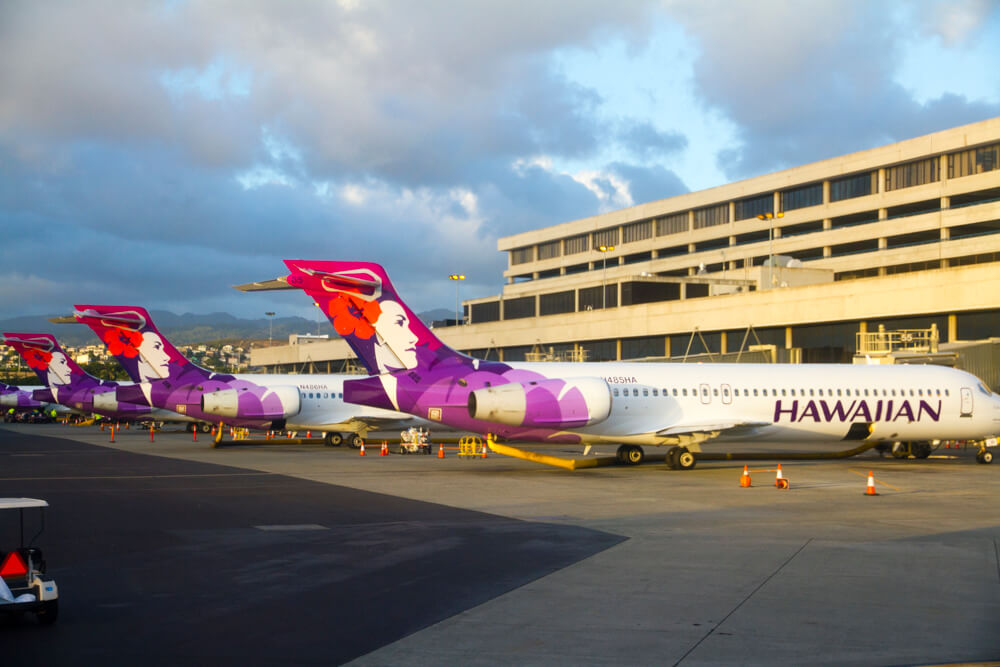
Pualani (Flower of the Sky) debuted in 1973, as Hawaiian Air’s brand image. Since then she has become a much loved icon of the Airline, but saw little change for 22 years.

But then, in 2001, Hawaiian Airlines unveiled a radically different version of Pualani. This version would first appear on their new (at the time) Boeing 717-200s, and later, Boeing 767-300s.

This new version of Pualani wasn’t just a revised version of a much loved brand icon. The 2001 Pualani represented a major shift at the Airline. That year saw the beginning of a major fleet renewal project and the start of the airline’s major route expansion.
Why Change Now?
Today, Hawaiian Airlines is on the verge of yet another major change. At the end of the year, the Airline will welcome its first ever single-aisle, long-haul aircraft: the A321neo. And in a few years, the Airline will also begin welcoming its new A330-800s. These new aircraft are largely expected to open up new routes for the Airline, further extending its reach. And impending new growth is why Hawaiian chose to update its brand now.
The New Brand
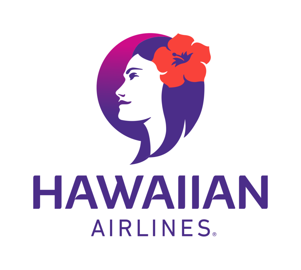
Hawaiian’s new brand is, unsurprisingly, a refresh of the existing Pualanai brand.

The biggest changes most will notice are the freeing of Pualani from her old floral holding shape, and the new typeface. In place of the floral holding shape is now a “sun.”

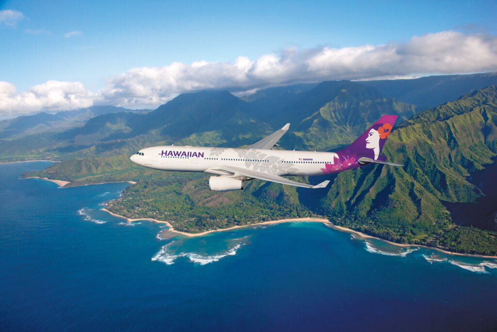
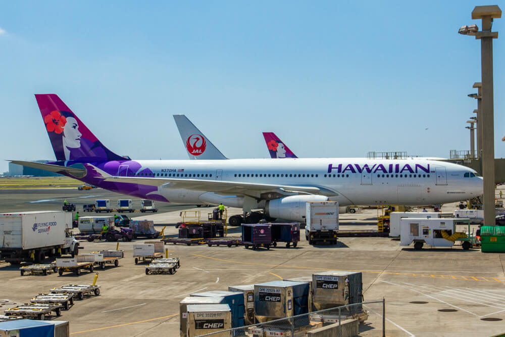
On the aircraft, however, the “sun” element disappears. Instead, a gradient fully engulfs the tail and allows Pualani to stand free and proud. On the lower portion of the tail a brighter floral pattern has been adopted, while a silver maile lei has also been “draped” over the aircraft’s fuselage.
According to Hawaii’s press release “Pualani continues to gaze forward on the tail of the aircraft; beneath her, a silver maile lei with woven pakalana flowers wraps around the fuselage in a larger-than-life expression of the aloha spirit.”

For a more detailed explanation of Hawaiian’s brand and the story of the brand refresh effort, check out this video:
Hawaiian Airlines Brand Refresh Final Thoughts
Hawaiian Air’s branch refresh is a evolution of the previous design. I think this is a good thing, as I’m a fan of the 2001 Pualani design. What I don’t care for with the brand refresh, however, is the “sun” element on the standalone logo. To me, it looks a little odd and is an element they probably could have done without.
What I do like, however, is the way the refreshed Pualani looks on the aircraft. She’s more cleaner and more prominent now. That being said, the floral pattern beneath her and the maile lei element makes the livery feel a little busy. I wouldn’t be surprised, though, if these elements grow on me with time. After all, I found American Airlines new livery to be, well, hideous when it debuted. But today, I actually kind of like American’s new livery.
Overall, I’m happy Hawaiian chose to modernize their brand rather than make radical changes. While I’m not a fan of the “sun” element, I do like the new livery overall. Especially on the Airline’s A330 fleet.
Oh, and if you’re hoping to catch a glimpse of the new livery outside of Hawaii, good luck. The first repainted aircraft is N388HA, which is a Boeing 717-200. There’s not precise timeline on aircraft repainting, though Hawaiian says repainting of all aircraft should be complete by the end of 2020.

I agree I think it looks nice.